
Technical analysis is an alternative investing strategy to fundamental analysis and if used correctly can be especially effective.
Stock charts are like Swiss Army knives, they are super handy tools that can be used in a variety of ways. Not only do they tell a story of the stock, but they can also be used to make precise investment decisions. The style of using stock charts to make these investment decisions is known as technical analysis and is often viewed as the polar opposite of fundamental analysis. Whether using technical analysis or not, knowing how to read stock charts is extremely important to any investor.
What is Technical Analysis?
Where fundamental analysis looks at the stock’s financial statements, its competitors and markets, technical analysis uses various stock charts to determine if the company is invest-able, pin-pointing the best price and time to invest. A stock chart shows you the history of a stock’s price over time and comes in a variety of formats. There are a multitude of variables that you can control in the display of stock charts that are essential to the use of technical analysis including:
- Time: you can have stock charts that show minutes, days, weeks, months or even years worth of price history.
- Chart style: you can display the data as a line graph, mountain, graph, OHLC (Open-High-Low-Close), Candlesticks, and more.
- Scaling: the vertical axis can usually be adjusted between arithmetic and logarithmic scales. The arithmetic scale is what you would expect, showing the horizontal lines at even intervals of $5 or $10 dollars ($50 in the case of Google). The logarithmic scale give you a better visual of the percent change in stock price so that a stock that the distance between a price of $20 and $40 is the same distance as $40 to $80 (both of which are 100% returns).
- Volume: displays the amount of shares trading hands everyday usually as a bar graph.
- Moving Averages: are among the most popular and important tool available to newer investors because they are easy to use and understand. Also, moving averages are used as components in many other charts and analyses. By smoothing out data points and number series, moving averages make it easier to identify trends and tendencies. (More on Moving Averages below).
- Trend lines: graphically display the unmistakable direction in which a stock is heading.
The key to technical analysis is the history of prices paid for a stock and the volume of shares traded. The security’s intrinsic value is of no concern to those who employ technical analysis as a trading method but rather rely on charts and other tools to identify patterns and trends that can suggest future activity. In other words, the only thing that matters is a security’s past trading data and what information this data can provide about where the security might move in the future. The field of technical analysis is based on three primary assumptions: price moves in trends, the market discounts everything, and history tends to repeat itself.
Technical analysis can be used on any security with historical trading data. Alternative investments such as Forex, fixed-income securities (think bonds), futures and commodities are all ripe for analysis of the technical sort as well. The common application, however, remains on traditional stocks. There are variety of pre-determined chart patterns that have been identified, labelled and used by those who employ the use of technical analysis for stock investing.
Types of Trading Patterns
Technical analysis investors attempt to identify charting patterns and trade the stock based on these pre-determined price movements. Here are some brief examples of the most popular trading patterns identified in technical analysis.
Double Bottom and Top: these formations are reversal patterns that most often identify medium term and long term trend changes.
Cup and Handle: this formation literally resembles it’s named a cup with a handle at the end. It is widely known thanks to the CANSLIM trading strategy popularized by William O’Neil.
Saucers: also known as “rounded bottoms” or “U-Shape” formation have the same look and feel to them as the Cup and Handle pattern, except they lack a handle and often have a wider base. They are more difficult to trade as finding a proper entry point can be tricky, however when spotted, they can yield large returns.
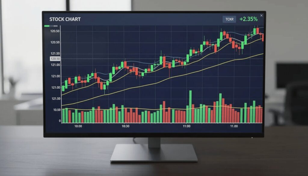
Candlestick Charts
Candlestick charts have become the dominant format for technical traders in financial markets. Each candle consists of a rectangular “body” spanning from open to close, with thin “wicks” or “shadows” extending to the high and low. Up days typically display green or white bodies; down days show red or black.
Candlesticks help visualize intraday sentiment shifts through recognizable formations:
- Doji: Open and close nearly identical, signaling indecision
- Hammer: Small body at top with long lower wick, often appearing at support
- Engulfing: Current candle completely engulfs the prior candle’s body
These patterns, which we’ll explore later, form the basis of many trading signal systems. Most popular pattern scanners on TradingView or StockCharts are designed around candlestick recognition, making this chart type essential for active traders.
Your charting decisions depend heavily on three foundational elements: timeframe, price scaling, and volume interpretation. Ignore any of these, and your analysis may mislead rather than inform.
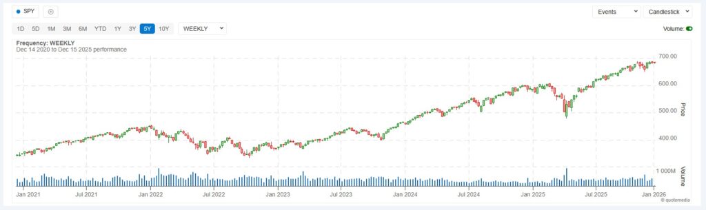
A daily chart of SPY from 2020–2025 can show a clear bull trend with pullbacks and recoveries. But zoom into a 5-minute chart on a volatile day, and the same instrument looks chaotic—whipsawing between support and resistance levels within hours. The trend you identify depends entirely on the time frame you choose.
Price scaling matters for longer-term analysis. When viewing Amazon (AMZN) from 2010–2025, a linear scale compresses early price action into an unreadable sliver at the bottom. A logarithmic scale shows percentage moves proportionally, making multi-year exponential growth readable and comparable across different price levels.
Trading volume—the number of shares traded during each period—acts as the “fuel” behind price movement. When META rebounded after its February 2024 earnings report, abnormal volume spikes confirmed institutional participation. High volume on breakouts suggests conviction; low volume suggests the move may lack follow-through.
Key building blocks to remember:
- Timeframe alignment: Match your chart to your strategy (1-minute for day traders, daily/weekly for investors)
- Scale selection: Use logarithmic for long-term charts, linear for short-term
- Volume confirmation: Strong moves require strong volume; weak volume often signals false signals
Uptrends, Downtrends, Ranges, Support, Resistance
Nearly every chart pattern is built on three market conditions: advancing trend, declining trend, or sideways consolidation. Before identifying complex formations, you must first read the basic trend structure.
An uptrend is defined as a series of higher highs and higher lows. Each rally pushes beyond the previous peak, and each pullback holds above the previous trough. The 2016–2021 bull market in the S&P 500 exemplifies this pattern perfectly—a steady staircase of rising peaks and rising floors.
A downward trend shows the opposite: lower highs and lower lows. Each rally fails to reach the prior peak, and each decline breaks below the prior trough.
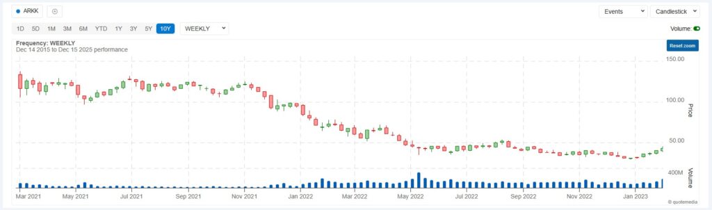
The 2022 bear market in growth stocks like ARKK and many tech names demonstrated this structure clearly. Sellers controlled the tape, and buyers couldn’t reclaim lost ground.
Trading ranges occur when price oscillates between defined boundaries. Intel (INTC) spent extended periods in the early 2020s bouncing between roughly $25 and $35 without establishing a clear directional trend. In these environments, breakout traders wait patiently while range traders buy near support and sell near resistance.
Support functions as a “floor” where buying demand tends to halt declines. Resistance acts as a “ceiling” where selling pressure caps advances. Tesla (TSLA) repeatedly found a support level near $100 in early 2023, bouncing each time sellers pushed price toward that zone. Later, $300 acted as resistance, with multiple failed attempts to break higher.
These concepts—higher highs, lower lows, support and resistance—form the vocabulary you’ll use to describe any price chart and identify potential investment opportunities.
Stock Chart Patterns
Stock charting often means recognizing recurring shapes that reflect the ongoing battle between buyers and sellers. Flags, triangles, head and shoulders, double tops and bottoms—these formations encode market psychology into visual structures.
Chart patterns fall into three categories:
- Continuation patterns: The existing trend pauses, consolidates, then typically resumes in the same direction
- Reversal patterns: The prevailing trend exhausts itself, and price prepares to move in the opposite direction
- Bilateral patterns: Price coils into a neutral formation where either a continuation or reversal is possible
Understanding these classifications helps you set realistic expectations. A bullish flag in Apple during 2021 often led to higher prices, but many flags failed during the 2022 tightening cycle when macro forces overwhelmed technical setups. Patterns improve your odds—they don’t guarantee future results.
Continuation Patterns
Markets breathe between legs of a move. After a strong advance, price often consolidates in compact ranges or angled formations before resuming the prevailing trend. Recognizing these pauses helps traders add to positions or find fresh entries.
Flags are rectangular consolidations that slope against the prior trend. After the November 2020 vaccine announcement rally, SPY formed a bullish flag—a slight downward drift on declining volume before breaking higher. The pattern signaled that sellers couldn’t gain control, and buyers were simply resting.
Pennants are small, converging triangles following sharp moves. Crypto-related stocks during 2021–2024 frequently showed pennants after news-driven spikes. The narrowing price action reflected decreasing volatility before the next leg.
Ascending triangles feature a flat resistance line with rising support—higher lows pressing into a ceiling. Nvidia formed ascending triangles during its 2023–2024 AI-driven uptrend, with each push toward resistance building pressure until price breaks through.
Wedge patterns offer subtle signals. Rising wedges often precede pullbacks within uptrends (bearish sentiment building despite higher prices), while falling wedges often precede rebounds in downtrends (selling pressure exhausting itself).
Each bullish continuation pattern shares common elements:
- Compact consolidation after a directional move
- Declining volume during the pause
- Breakout in the direction of the prior trend on expanding volume
Reversal Patterns
Reversal patterns suggest a trend is losing momentum and may flip direction. These formations represent distribution phases at tops or accumulation phases at bottoms.
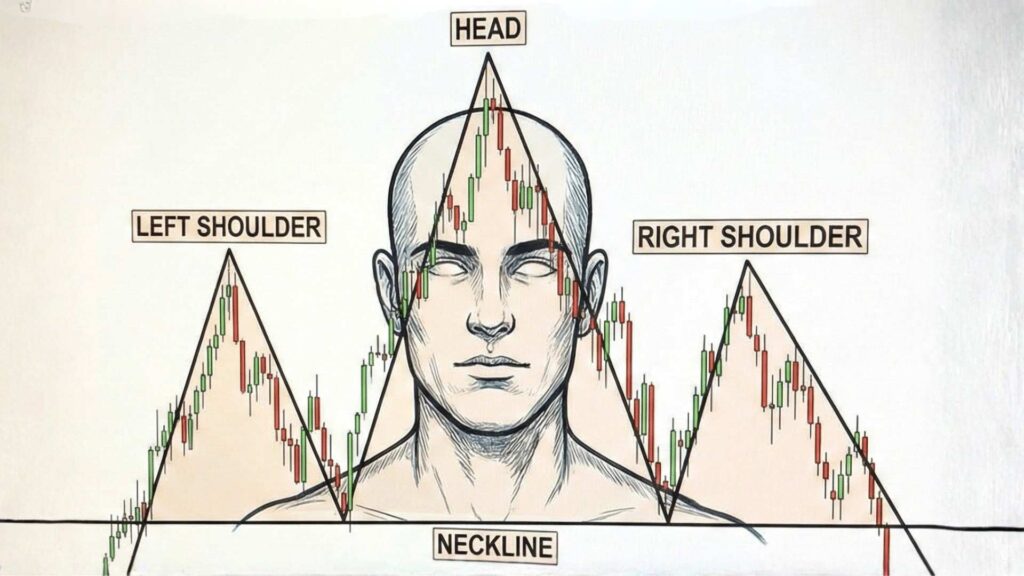
Head and shoulders is perhaps the most recognized reversal pattern. It features three peaks: a higher middle peak (head) flanked by two lower peaks (shoulders), connected by a “neckline” at the troughs between them. Many high-growth stocks formed head and shoulders tops throughout 2021 before the 2022 drawdown. When price breaks below the neckline—especially on heavy volume—the trend reversal often accelerates.
Double tops occur when a security’s price reaches a resistance line twice and fails both times. Imagine a stock pushing to $100, pulling back, rallying to $100 again, then reversing lower. The repeated failure signals that buyers cannot overcome sellers at that level. Double bottoms work identically in reverse—two troughs at similar prices followed by a rally.
Rounding tops and bottoms are slower, more gradual transitions spanning weeks or months. These patterns often appear in commodities or sector ETFs during multi-year cycles, reflecting gradual shifts in supply and demand rather than abrupt reversals.
Critical elements for confirming reversal patterns:
- Clear definition of the “neckline” or key breakout level
- Volume expansion when price breaks that level
- Higher reliability on daily and weekly charts versus noisy intraday time frames
Bilateral and Neutral Patterns
Bilateral patterns represent coiling energy where the chart alone doesn’t indicate direction until the break occurs. These formations require patience and preparation for moves in either direction.
Symmetrical triangles feature two converging parallel trendlines—descending resistance and ascending support—squeezing price into a tighter range. The NASDAQ 100 often forms symmetrical triangles before key Federal Reserve meetings, as traders await clarity before committing. Once price breaks beyond either trendline, the move can be explosive.
Megaphone or broadening formations show expanding volatility—higher highs and lower lows creating an increasingly volatile range. These patterns appeared during policy uncertainty periods like the 2011 and 2023 debt-ceiling debates, reflecting an increasingly volatile market where consensus is absent.
Rectangles and horizontal channels feature two parallel trendlines containing price action. Traders might buy near support and sell near resistance, but also watch for breakouts that signal the consolidation is ending.
When trading bilateral patterns:
- Reduce position size before the breakout since direction is uncertain
- Set alerts at key levels to catch the move early
- Wait for a confirmation candle and volume surge before committing
Trendlines, Moving Averages, and Volume
Chart patterns rarely stand alone. Skilled traders confirm them with supporting technical analysis tools like trendlines, moving averages, and volume analysis.
Trendlines connect swing points to visualize trend direction and potential support or resistance. In an uptrend, draw a line connecting at least two (ideally three) swing lows. Each time price pulls back to this line and bounces, the trendline gains significance. Use daily closes or candle bodies for cleaner lines rather than wicks, which can create false signals.
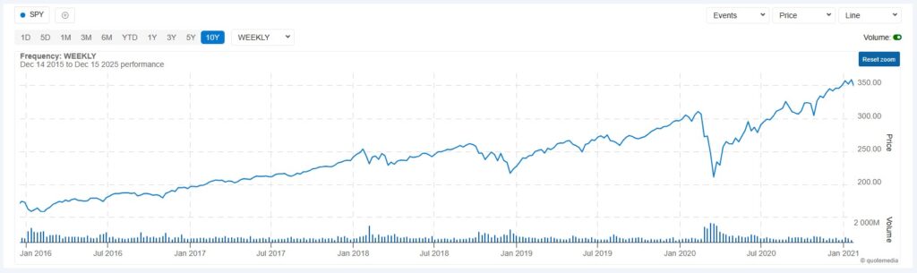
Moving averages smooth price data over a specified period, revealing the underlying trend beneath daily noise. The 50-day and 200-day simple moving averages (SMAs) are widely watched. When the 50-day crosses above the 200-day—a “golden cross”—it signals potential bullish momentum, as occurred in the S&P 500 during March 2009’s recovery. The reverse “death cross” appeared in early 2022 before the bear market deepened.
For different trading styles:
- Day traders: 10-day and 21-day MAs for quick trend reads
- Swing traders: 50-day MA as dynamic support/resistance
- Investors: 200-day MA as the line between bull and bear markets
Volume confirms or questions price moves. Breakouts accompanied by rising volume suggest conviction and follow-through. Breakouts on weak volume often fail or quickly reverse. When analyzing any pattern—flags, triangles, head and shoulders—always check whether volume supports the move.
These technical indicators work best in combination. A breakout from an ascending triangle, occurring above a rising 50-day MA, with volume surging 2x average, offers stronger conviction than any single signal alone.
How to Read a Stock Chart Step-by-Step
Reading charts effectively requires a systematic approach. Here’s a numbered workflow for analyzing any ticker—let’s use SPY in mid-2025 as our example.
Step 1: Choose your timeframe
Align your chart to your trading strategy. Day traders work with 1-minute to 15-minute charts. Swing traders use 4-hour and daily charts. Investors and position traders focus on daily and weekly views. For swing trading SPY, start with the daily chart.
Step 2: Identify the major trend
Look at price action over the past several months. Is SPY making higher highs and higher lows (uptrend), lower highs and lower lows (downtrend), or oscillating sideways (range)? Overlay a 50-day and 200-day MA. If price is above both and they’re sloping upward, the trend is bullish.
Step 3: Mark support and resistance zones
Identify prior reaction points—peaks where price reversed lower and troughs where price bounced higher. Look back at least 6–12 months for swing trading. Draw horizontal lines at these levels. These become your key zones for potential entries and exits.
Step 4: Look for recognizable patterns
Is price forming a flag, triangle, double bottom, or head and shoulders near any key zone? A triangle compressing against resistance might precede a breakout. A double top at a prior high might signal exhaustion.
Step 5: Check volume and simple indicators
Does recent volume confirm the pattern? Are indicators like RSI (Relative Strength Index) or MACD (Moving Average Convergence Divergence) aligned with your thesis? Overbought RSI at resistance adds caution; oversold RSI at support adds opportunity.
Step 6: Outline a basic plan
Define your potential entry level (e.g., breakout above triangle resistance). Set your stop-loss just beyond the invalidation point (e.g., below the triangle’s lower trendline). Calculate a realistic target based on the pattern’s measured move or the next resistance level. Ensure your risk-reward ratio is at least 2:1.
Review weekly charts of major indexes (SPY, QQQ) and your watchlist of favorite US stocks. Note any patterns developing near key levels. Identify stocks showing relative strength or weakness. Rather than chasing every ticker, specialize in a handful of instruments. SPY, QQQ, and a few large-cap stocks you understand offer more than enough opportunity without overwhelming complexity.
Before entering any trade, run through a simple checklist:
- Is the trend direction clear?
- Are key support and resistance levels identified?
- Is a recognizable pattern present?
- Does volume confirm the setup?
- Is the risk-reward ratio at least 2:1?
If you can’t answer “yes” to most of these questions, the setup isn’t ready. Walk away and wait for better conditions.
Here’s the reality: mastering stock charting typically takes months to feel comfortable and years to become consistently profitable. The patterns in this article aren’t secrets—they’re widely known. Your edge comes from discipline, patience, and continuous learning.
The charts won’t make you rich overnight, and they can’t predict every future price movement. But they offer a framework for navigating uncertainty, identifying investment opportunities, and managing risk in dynamic markets. Start with paper trading or small positions. Track your results honestly. Learn from losses as much as wins.
Markets reward those who show up prepared, stay humble, and adapt when conditions change. Your charting journey is just beginning—approach it with curiosity, discipline, and realistic expectations.
Rank of Top Stock Newsletters Last 3 Years, as of May 31, 2026
We are paid subscribers to dozens of stock and option newsletters. We actively track every recommendation from all of these services, calculate performance, and share our results of the top performing stock newsletters whose subscriptions fees are under $500. The main metric to look for is "Return vs S&P500" which is their return above that of the S&P500. So, based on May 31, 2026 prices:
Best Stock Newsletters Last 3 Years' Performance
| Rank | Stock Newsletter | Picks Return | Return vs S&P500 | Picks w Profit | Max % Return | Current Promotion |
|---|---|---|---|---|---|---|
| 1. | Alpha Picks | +110% | +83% | 76% | 1,571% | June, 2026 Promotion: See all their picks & get $124 off |
| Summary: 2 picks per month based on Seeking Alpha's Quant Rating; consistently beating the market every year since launch; tells you when to sell and they have sold almost half. See complete details in our Alpha Picks Review. Or get their Premium service to get their QUANT RATINGS on your stocks to better manage your current portfolio--read our Is Seeking Alpha Worth It? article to learn more about their Quant Ratings. | ||||||
| 2. |  Zacks Value Investor | +58% | +46% | 53% | 1,134% | June, 2026 Promotion: $1, then $495/yr |
| Summary: 10 stock picks per year on January 1st based on Zacks' Quant Rating; Retail Price is $495/yr and includes 6 different services including those below. Read our Zacks Review. | ||||||
| 3. | Zacks Top 10 | +31% | +19% | 74% | 170% | June, 2026 Promotion: $1, then $495/yr |
| Summary: 10 stock picks per year on January 1st based on Zacks' Quant Rating; Retail Price is $495/yr and includes 6 different services. Read our Zacks Review. | ||||||
| 4. |  Action Alerts Plus | +20% | +6% | 61% | 208% | Current Promotion: None |
| Summary: 100-150 trades per year, lots of buying and selling and short-term trades. Read our Jim Cramer Review. | ||||||
| 5. |  TipRanks SmartInvestor | +13% | +5% | 57% | 266% | Current Promotion: Save $180 |
| Summary: About 1 pick/week focusing on short term trades; Lifetime average return of 355% vs S&P500's 149% since 2015. Retail Price is $379/yr. Read our TipRanks Review. | ||||||
| 6. | Zacks Home Run Investor | +7% | +2% | 43% | 337% | June, 2026 Promotion: $1, then $495/yr |
| Summary: 40-50 stock picks per year based on Zacks' Quant Rating; Retail Price is $495/yr. Read our Zacks Review. | ||||||
| 7. |  Moby.co | +19% | 0% | 55% | 797% | June, 2026 Promotion: Get #1 Stock Pick Free |
| Summary: All it requires is an email address to get their #1 stock pick free; 60+ stock picks per year, segmented by industry; consistently beating the market every year; retail price is $365/yr but save try it for $99. Read our Moby Review. | ||||||
| 8. | IBD Leaderboard ETF | 11% | -1.8% | n/a | n/a | June, 2026 Promotion: NONE |
| Summary: Maintains top 50 stocks to invest in based on IBD algorithm; Retail Price is $495/yr. Read our Investors Business Daily Review. | ||||||
| 9. | Zacks Under $10 | +0.4% | -3% | 33% | 263% | June, 2026 Promotion: $1, then $495/yr |
| Summary: 40-50 stock picks per year based on Zacks' Quant Rating; Retail Price is $495/yr. Read our Zacks Review. | ||||||
| 10. | Dogs of the Dow Strategy | +6% | --7% | 50% | 34% | Current Promotion: None |
| Summary: Buy the 10 highest yielding dividends stocks in the Dow Jones Industrial Average on January 1st and sell on Dec 31st each year. | ||||||
| 11. | Stock Advisor | +7% | -17% | 59% | 141% | June, 2026 Promotion: Get $100 Off |
| Summary: 2 picks/month and 2 Best Buy Stocks lists focusing on high growth potential stocks over 5 years; Retail Price is $199/yr. Read our Motley Fool Review. | ||||||
| 12. | Rule Breakers | +11% | -18% | 51% | 208% | Current Promotion: Save $200 |
| Summary: Rule Breakers is included with the Fool's Epic Service. Get 5 picks/month focusing on disruptive technology and business models; Lifetime average return of 355% vs S&P500's 149% since 2005; Now part of Motley Fool Epic. Read our Motley Fool Epic Review. | ||||||
| Top Ranking Stock Newsletters based on their last 3 years of stock picks covering 2026, 2025, 2024, and 2023 performance as compared to S&P500. S&P500's return is based on average return of S&P500 from date each stock pick is released. NOTE: To get these results you must buy equal dollar amounts of each pick on the date the stock pick is released. Investor Business Daily Top 50 based on performance of FFTY ETF. Performance as of April 5, 2026. | ||||||